Plates That Paint: Color Theory in Presentation and Garnishing
Seeing Flavor: The Psychology of Color on the Plate
Warm Hues, Bold Appetite
Use scarlet sauces, paprika oil, or roasted peppers when you want urgency and appetite. Warm hues increase perceived temperature and sweetness, making slow-braised meats seem richer and roasted vegetables more lively. Balance heat with a cool counterpoint, like yogurt, cucumber, or a pale, nutty crumb that steadies the rush.
Cool Tones, Calm Balance
Cool blues are rare in nature’s pantry, so lean on jade herbs, teal ceramic glazes, and icy greens to convey calm, cleanliness, and restraint. These tones temper spicy dishes and spotlight freshness. A mint emulsion, chilled glass plate, or cucumber ribbons can lower perceived heat and steady pacing.
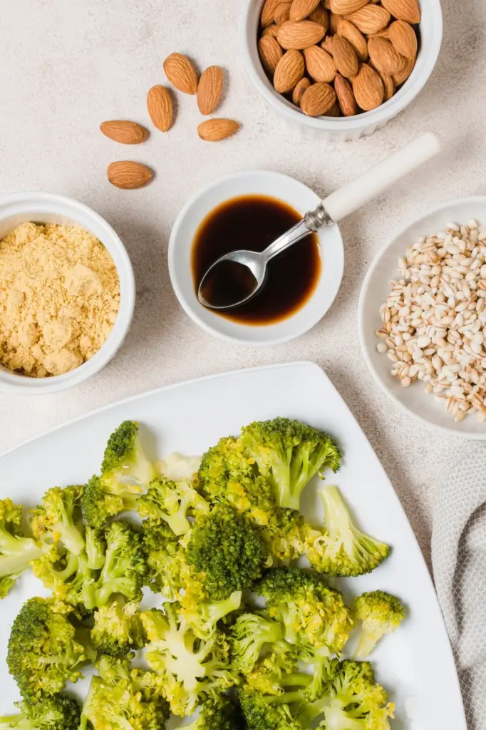
Neutrals as a Canvas
Beige, taupe, and charcoal create restful ground, letting accent ingredients sing. When your main element is visually busy, anchor it with a quiet base: parsnip puree, black rice, or sesame ash. Neutrals frame color relationships, prevent saturation fatigue, and guide forks toward the bite you intended.
Palette Building: Harmonies, Contrasts, and Accents
Textures, Sheens, and Light: Making Color Pop
Gloss Versus Matte Finishes
Glaze proteins to deepen perceived color and richness, then surround with matte vegetables so the eye lands where you intend. Conversely, a matte tahini swipe can calm an overly shiny stew. Use sparingly; excessive gloss can look greasy rather than luxurious under warm lighting conditions.
Crisp, Creamy, and Crunchy
Juxtapose crispy shards with silky purées to create micro-contrasts that wake color up. Crunch throws tiny shadows, making adjacent hues appear more saturated. Meanwhile, ultra-smooth textures reflect light evenly, ideal for showcasing delicate pigments like pea chlorophyll, matcha oil, or clarified tomato essence.
Lighting for Honest Color
Natural daylight reveals true color, while some LEDs skew toward blue or red. Test your plates near windows and under service lamps, then adjust saturation and garnish brightness accordingly. Photograph on neutral backgrounds to judge accuracy, and keep white balance consistent across your visual portfolio.
The Rule of Odds on the Plate
Negative Space as Breathing Room

Directional Flow Guides the Eye
Herbs as Living Color
Choose tender sprigs that echo or gently contrast the main hue. Basil deepens greens, dill cools warm oranges, and purple shiso adds moody shadow. Snip to size, blot moisture, and position with tweezers so each leaf feels deliberate, aromatic, and proportionate to the bite.
Citrus, Seeds, and Crunch
A squeeze of lime, toasted sesame, or crushed pistachio adds sparkle and structural crunch that refracts light, brightening adjacent colors. Scatter purposefully along transitions, not everywhere. The goal is rhythm, not noise, so bites alternate between refreshing snap and deeper, lingering satisfaction.
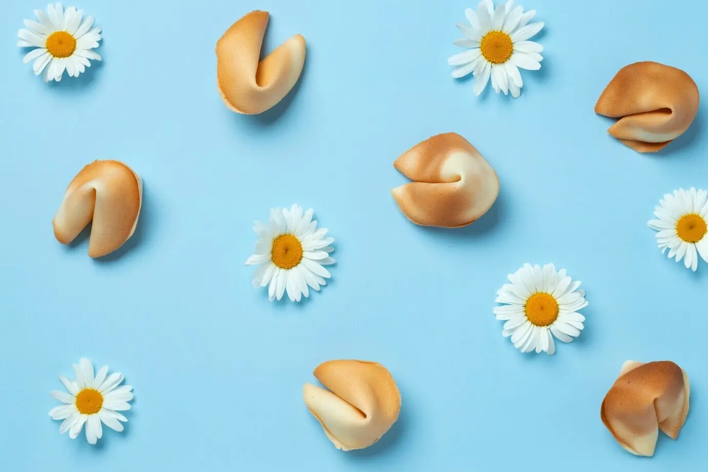
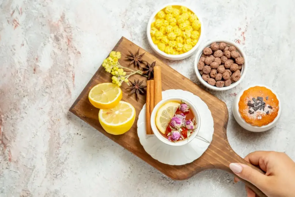
Edible Flowers With Purpose
Use blossoms with defined flavors—nasturtium pepper, borage cucumber, marigold citrus—to align taste with visual promise. Keep petals pristine by chilling and plating at the last moment. Repeat colors already present so flowers integrate seamlessly rather than feeling decorative or disconnected from the dish’s intent.
Seasonality and Sourcing for Authentic Color